Awhile back I had someone ask me to show them how I make the opaque layers that you see in some of my photos (specifically, the header on the mustang forum.) Since I just learned a new technique from Darling yesterday, I thought it was a good time to create a new header, and I might as well post the how to for those of you who may be interested in trying your hand at it.
I started with a new, blank page. Then I created stripes. They're difficult to see in the header above since I covered them with the photo, but you can play with different shades and colors.
Start by selecting File and New from the drop down menu. I wanted my new project to be 4x6, which is in the preset sizes. You can rotate your new page by by selecting Image, then Rotate, so that your new project is wider than it is tall (if that's what you'd like.)
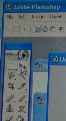 First...let's create background stripes:
On the tool bar, in the upper left corner, is that little dashed line square. Click this and then take that tool over to your blank screen. You can now drag it into any size square by using your left click button on your mouse. Once it's the size you'd like, right click on your mouse and a new tiny little screen will pop up; on that screen, select Layer Via Copy.
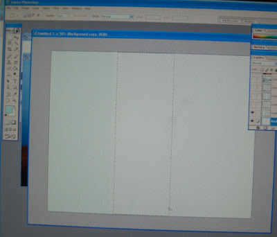
You little striped line will disappear, but if you look at the Layers screen you will see that you have two layers now showing; one is the original background and the second is the small square or rectangle that you just made.
Go back to your tool bar and select the paint can, and choose which color you would like to use. Take your paint can to your page and click on the layer you'd like to color. In the photo above, I used an ice blue color.
If you'd like several stripes of uniform size, rather than trying to judge if you've got the same width each time right click on the layer you just made and another option screen will appear like below. Click Duplicate Layer.
If you'd like several stripes of uniform size, rather than trying to judge if you've got the same width each time right click on the layer you just made and another option screen will appear like below. Click Duplicate Layer.
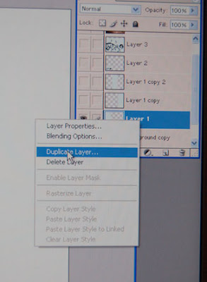 Your Duplicate Layer will be laying directly on top of the first layer, so you'll need to move it. In the first photo, the move tool is shown at the top right. Select it, then left click your mouse to drag your new layer to someplace else on your screen.
You can make each stripe a different color simply by highlighting the layer you're working on in the layers screen, then using your paint bucket to fill in the desired color.
Now let's add layers:
Below is a piece of clip art that Darling has here on my computer. If you're a techno savvy person, then you'll know how to get this stuff onto photoshop without the help of a 15 year old. If you haven't got a clue, and you haven't got a teenager living in the house, I suggest renting the neighbor kid. Trust me, they know these things.
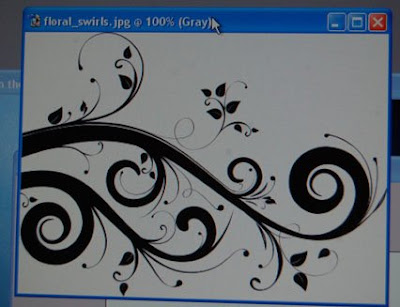
I used my move tool to get the clip art onto my striped screen, below.
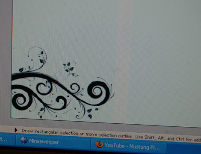
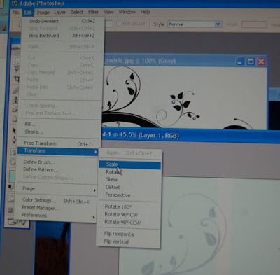
Because it was originally too small and didn't take up as much space as I wanted, I had to change the size. Click Edit and from the drop down menu select transform, then scale. This will allow you to drag the corners of your selected layer (in this case, the layer we are most recently working on) and change the size.
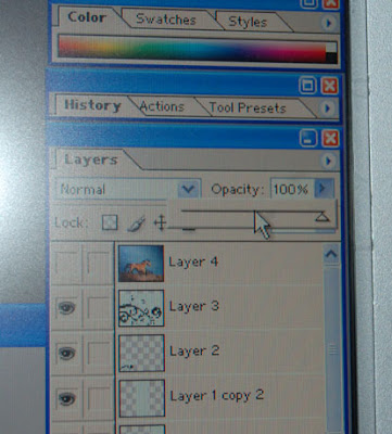
You may also notice that in the header, the scrolled art work has been used twice. First in the bottom corner as well as filling in the background. To create the opaque look of the second, larger image I used the opacity tool on the layers screen. All you need to do is slide that little triangle back and forth until you decide just how transparent you want the layer you're working with.
 Now that I had my stripes and my art work, I wanted to add a photo. I opened up the old dun stallion from my files. I could have just drug the photo on over (don't worry, your original won't disappear forever into the piece you're working on), but I knew it was much larger than the striped page. To make life easier, I made a copy of the original photo and resized it to match the striped background. That simply meant I wouldn't have to try to use the resize tool once my photo was on the new image. Trust me...resizing things smaller isn't as simple as making them larger.
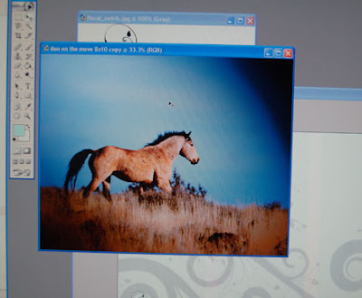
Now that the old dun was part of my project, I decided he needed to be lightened up a touch, just like the scrolled art work had been, so again I used the opaque function in layers so that the art work would show through.


4 comments:
Very nice Tracey! Thanks for the lesson, your daughter is one smart cookie! I have PhotoShop, an old version, can't remember what one but maybe I will try playing with some pictures. (If I can't get it, can I borrow your kid???) LOL
Is that how you did the background of your blog also? It's neat too!
Jane and Gilly
Jane, thank you. You're not alone in wanting to borrow Darling. I'm thinking for a small fee I'll rent her out, lol!
Cool lesson. Can I just send a photo to Darling and have her do it for me? Hee hee! I don't have photo shop so I can't experiment with layers yet, but I sure hope to someday! I love how the new header turned out, by the way!
LOVE the new header! It's truely beautiful!
Post a Comment